By James Milstid
There is no question that The United States of America has the most powerful military in the world.
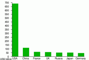
The chart to the left gives a pretty good picture of why that is. The U.S. military budget far and away exceeds any other single nation. Our warfare technology is beyond cutting edge and when used is dominating and frightening.
As the saying goes, “Freedom is not free.” I understand that and subscribe to it. In this uncertain time of world turmoil, a strong military defense is necessary for the preservation of the freedoms we enjoy.
But at what cost?
I certainly don’t have the answer to that, but comparing the world’s defense budgets begs an answer. Take a look at these numbers for the top seven world defense budgets compiled from various sources:
| Country | GDP | Mil. Budget | Population | Avg Salary | Defense Share |
|---|---|---|---|---|---|
| $15.1T | $698.1B | 312M | $49,445 | $2,141 | |
| $11.3T | $114.3B | 1,339M | $8,394 | $75 | |
| $2.2T | $61.3B | 65.8M | $26,416 | $977 | |
| $2.3T | $57.4B | 61.8M | $26,312 | $940 | |
| $2.4T | $52.6B | 142.9M | $9,945 | $430 | |
| $4.4T | $51.4B | 128M | $24,697 | $401 | |
| $3.1T | $46.8B | 81.8M | $25,146 | $558 |
In looking at the numbers, it appears that our country is spending over $2000 per capita on defense alone. That means that our freedom is costing $2000 a year for every man, woman, and child. And that’s only the defense budget. What about education, social security, healthcare, transportation, and a whole litany of other expenditures?
I Googled “US budget pie chart” and wasn’t at all surprised to find liberal and conservative versions of how our government spends money. My goal was to get a feel for how much every man, woman, and child is responsible for. It turned out to be very difficult to drill down to individual responsibilities. A very non-scientific bit of research resulted in anywhere from $5,000 to $10,000 per capita. That means that a family of four making $100,000 is out $20,000 to $40,000. I’ve never paid that much in taxes. I doubt that many middle-class families have.
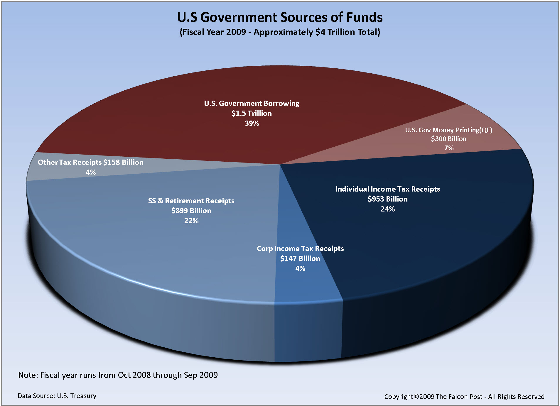
So where does the money to run our government come from? Best estimate says we need $4 trillion to keep our noses above water. A little napkin math tells me that it’s not coming from taxes alone.
Take a look at the following chart:

This chart was the most non-partisan indicator I could find. As I studied it, the first thing I saw was where a majority of our money comes from. A whopping 39%, $1.5 trillion is borrowed. Our income taxes amount to a little over half that, 24%, $953 billion. But hiding in the shadows is corporate taxes for a tiny 4%, $147 billion.
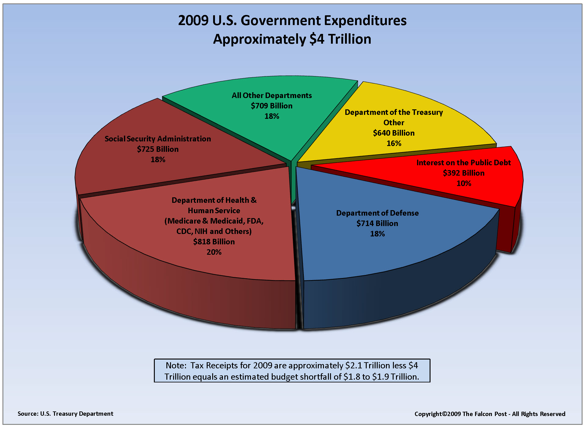
The next chart give a simplified idea of where the money goes.

…
Our elected legislators are consciously and knowingly trapped in a political quagmire, each faction insisting that their way is the only way out of the mess. In the meantime, we, as a nation, are sinking deeper and deeper into the sludge. Surely there have been reasonable solutions, but they would require compromise; something that is avoided at all cost in our politically-charged congress.
[To be continued…]
Sources:

